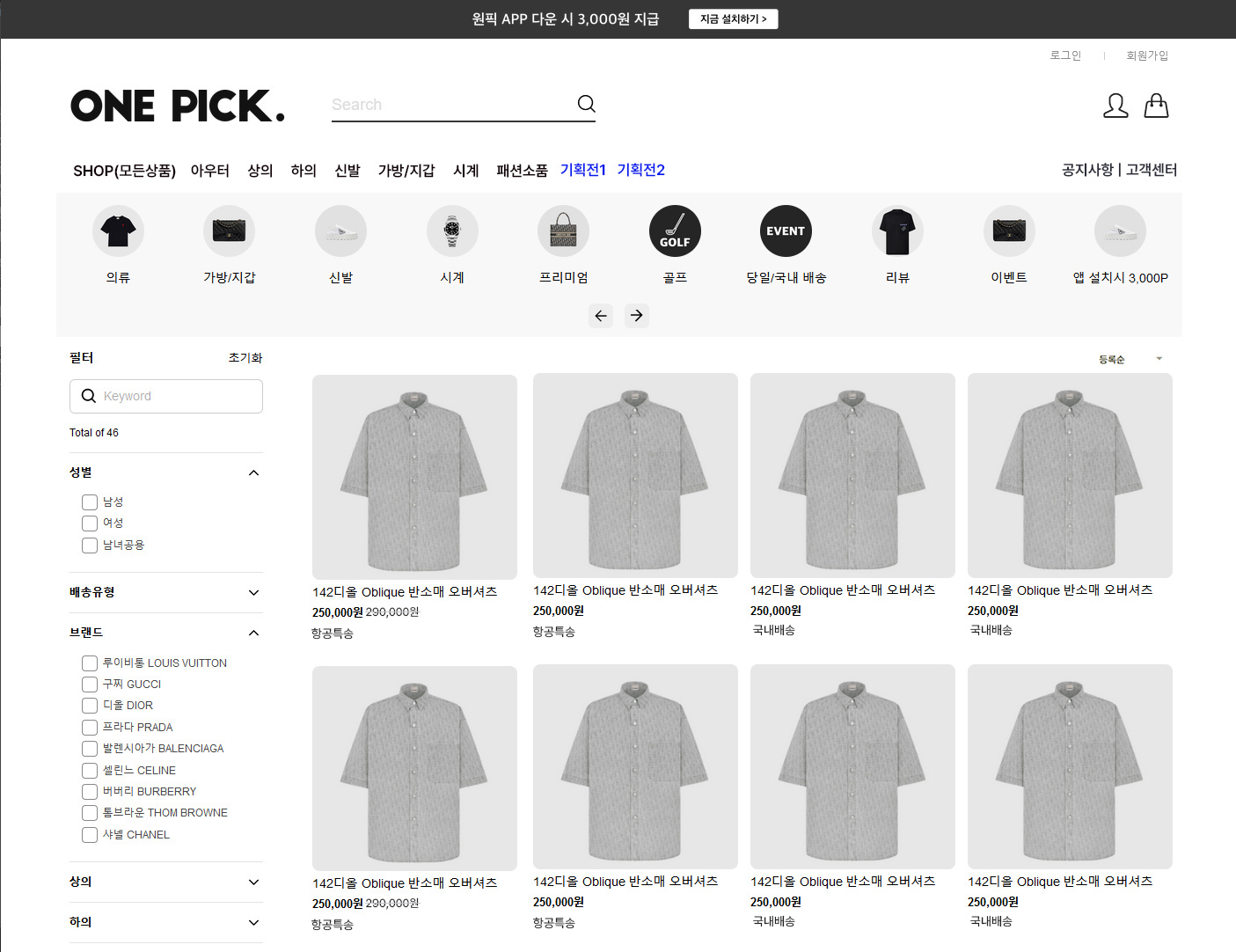
Descrrrription (화면 설명)
디자인 요소에 대한 수정 ,보완 요청 사항의 경우,
글로 자세히 적고 예시와 캡쳐화면 등을 첨부해도 “글”이라는 한계 때문에 한번의 요청과 수정 작업으로는 제대로 마무리 될 수 없음을 잘 알고있습니다.
그렇기에 디자인 적인 요소에서 저희가 콘트롤 할 수 있는 부분이 어디까지인 체크도 해볼겸해서….CSS 직접 수정해보았습니다.
수정 결과 작업하시고 렌더링 된 코드에서 CSS 추가, 수정 작업만으로도 저희쪽에서 원하는 디자인 작업 가능했습니다.
본 화면은 지난번 작업하여 올려주신 화면상태에서 CSS 추가, 수정을 통해 수정된 실제 화면을 캡쳐한 이미지입니다.
프로그램적으로 수정,보완 되어야할 디자인 관련 작업을 제외한 나머지 부분의 디자인 작업의 경우 저희쪽에서 진행하도록하겠습니다.
좌측의 1, 2, 3 을 클릭하시면 해당 영역에대한 수정,보완 요청 작업페이지로 바로가실 수 있습니다.
? 질문.
*작업중 class 추가나 일부 코드 수정이 필요한경우가 있을 수 있습니다. webflow 사용법등 알아보고 공부해도 모르겠거나 막힐때, 그때는 조언이나 도움 요청드려도 될까요?
body {
font-family: helvetica;
color: var(–color-scheme-1–text);
font-size: 13px;
line-height: 1.2;
}
#s202303192ab458e90a2f1 .inline-col-group {
padding-top: 10px;
padding-bottom: 10px;
height: 60px;
}
.div-block {
width: 100%;
margin-left: auto;
margin-right: auto;
max-width: 1280px;
background-color: #fafaf7;
}
.team-slider_btn_element {
background-color: var(–_primitives—colors–neutral-lightest);
border-radius: 6px;
justify-content: center;
align-items: center;
width: 2rem;
height: 2rem;
display: flex;
}
.section_gallery19 {
margin-left: auto;
margin-right: auto;
padding-top: 1rem;
padding-bottom: 10px;
overflow: hidden;
width: 100%;
max-width: 1280px;
}
:root {
–swiper-navigation-size: 41px;
}
.swiper-slide {
width: 10%;
}
.spacer-small {
width: 100%;
padding-top: 1.1rem;
}
.text-size-regular {
font-size: 0.9rem;
}
.filters1_heading {
font-size: 14px;
font-weight: 700;
line-height: 1.4;
}
.cate-slider_arrow-wrap {
justify-content: center;
align-items: center;
padding-top: 1rem;
/* padding-bottom: 1.rem; */
display: flex;
}
.team-slider_btn_element {
background-color: var(–_primitives—colors–neutral-lightest);
border-radius: 6px;
justify-content: center;
align-items: center;
width: 2rem;
height: 2rem;
display: flex;
}
.padding-section-large {
padding-top: 1rem;
padding-bottom: 3rem;
}
.filters1_layout {
grid-column-gap: 3rem;
grid-row-gap: 3rem;
grid-template-rows: auto;
grid-template-columns: max-content 1fr;
grid-auto-columns: 1fr;
display: grid;
}
.filters1_filters-wrapper {
max-width: 220px;
}
//필터 영역
.filters1_heading {
font-size: 14px;
font-weight: 700;
line-height: 1.4;
}
.aa_button.is-link {
background-color: #5656;
color: var(–_primitives—colors–neutral-darkest);
border-style: none;
padding: 5px;
line-height: 1;
text-decoration: none;
}
.form_input-2 {
/* border: 1px solid #545454; */
background-color: var(–_primitives—colors–white);
color: var(–_primitives—colors–neutral-darkest);
border-radius: 6px;
height: auto;
min-height: 2.75rem;
margin-bottom: 0;
padding: .5rem .75rem;
font-size: 14px;
line-height: 1.3;
}
.w-input, .w-select {
border: 1px solid #ccc;
width: 100%;
height: 38px;
display: block;
}
.spacer-small {
width: 100%;
padding-top: 1.1rem;
}
.filters1_filter-group-heading {
/* grid-column-gap: rem; */
grid-row-gap: 1rem;
border-top: 1px solid #e3e3e3;
cursor: pointer;
justify-content: space-between;
align-items: center;
padding-top: 12px;
padding-bottom: 12px;
display: flex;
}
.text-weight-semibold {
font-weight: 600;
}
.text-size-medium {
font-size: 13px;
}
.filters1_form-checkbox1 {
align-items: center;
margin-bottom: 0;
padding-top: 4px;
padding-bottom: 7px;
padding-left: 0rem;
display: flex;
}
label {
font-weight: 400;
max-width:100%;
}
.filters1_form-checkbox1-label {
position: relative;
/* display: inline-flex; */
/* align-items: flex-end; */
/* cursor: pointer; */
padding-left: 24px;
font-size: 12px;
align-content: space-between;
justify-content: flex-start;
flex-wrap: wrap;
color: #484848;
}
.product3_list {
grid-column-gap: 1rem;
grid-row-gap: 2rem;
grid-template-rows: auto;
grid-template-columns: 1fr 1fr 1fr 1fr;
grid-auto-columns: 1fr;
place-items: start;
display: grid;
}
.product3_item {
text-align: left;
flex-direction: column;
align-items: stretch;
width: 100%;
display: flex;
}
.product3_image-wrapper {
border-radius: 8px;
width: 100%;
overflow: hidden;
}
.product3_image {
aspect-ratio: 1 / 1;
object-fit: cover;
width: 100%;
height: 100%;
}
.spacer-xsmall {
width: 100%;
padding-top: 5px;
}
.text-size-regular {
font-size: 0.9rem;
}
.spacer-xxsmall {
width: 100%;
padding-top: .5rem;
}
.flex-block {
/* justify-content: center; */
align-items: flex-start;
margin-bottom: 20px;
}